What if success didn’t mean selling more, but selling better? That’s the power behind a one product Shopify store: one hero product, one clear message, and one streamlined path to conversion. By focusing on one hero item, you can master storytelling, design, and marketing – often outpacing multi-product stores in sales and brand loyalty.
In this guide, we’ll explore some of the best one product Shopify store examples that nailed it, uncovering what makes them work and what you can learn to build your own standout brand.
Scaling Beyond Your Hero Product?
As your one-product store grows, you’ll eventually add new variants, bundles, or product lines.
BulkFlow helps you upload everything fast by letting you import multiple products in one go – clean, structured, and ready to go live.
What is a one product Shopify store?
Shopify one product store is an online shop built entirely around one standout product. Unlike traditional eCommerce stores that manage a large quantity of products, a one product store focuses all branding, messaging, and marketing efforts on a single hero item – the one that defines the entire business.
Read more this article: How Many Products Can You Have on Shopify
This focused structure ensures your website, ads, and customer experience all center on a single offering. Visitors can immediately understand what you sell, why it matters, and how it improves their lives.
The strategy works best when your product solves a clear problem, offers a unique value, and resonates emotionally with your audience.
Key factors of a winning Shopify one product store in 2025
To thrive in 2025, a one product Shopify store needs more than just a great product. Here are the essential factors that help your 1-product store win:
- Eye-catching visual design: Your visuals should do more than decorate – they should sell. Every photo, video, and layout choice needs to highlight the product’s best features and benefits. A minimalist design with bold imagery and smooth scrolling keeps the focus exactly where it belongs: on your hero product.
- Engaging and aspirational storytelling: The best Shopify one product store connects its item to a deeper purpose or lifestyle. Instead of just listing specs, they tell a story about transformation – showing how the product solves a problem or empowers its users. This emotional link turns casual visitors into loyal fans.
- Strong social proof and reviews: When your store revolves around a single product, credibility is everything. You should showcase authentic reviews, real customer photos, and testimonials prominently. Influencer mentions, media features, or trust badges to further reinforce legitimacy and reassure first-time buyers.
- Clear and action-driven CTAs: You need to keep your calls to action clear and focused on a single goal – prompting users to buy right away. You should try to use strong, action-driven language and reinforce it with benefits or urgency. Also, remember to place CTAs early, repeat them throughout the page, and ensure they stay visible as users scroll.
20 Best One Product Shopify Store to Inspire You
Nothing explains the power of a one product store better than seeing it in action. From coffee to cosmetics, these brands prove that focusing on a single offer can create massive success – when it’s paired with smart branding, storytelling, and design.
Let’s explore 20 Shopify one product store examples that turned one product into a winning brand.
Food & beverage
1. Death Wish Coffee
Death Wish Coffee store is a strong example of a one product Shopify store. Death Wish Coffee built its entire brand around a single bold idea: “the world’s strongest coffee.” The product is a high-caffeine coffee blend sold in a signature black bag with a skull-and-crossbones logo – instantly telling customers exactly what they’re getting.

The website brings that intensity to life with dark visuals, sharp contrast, and bold typography that reinforce the brand’s fearless energy. The hero section is simple but powerful: a huge pack shot, a promise of potency, and a direct “Add to cart” button.
What makes the experience even stronger is its tight storytelling. Benefits like “no artificial flavors”, “fair trade”, and “smooth, bold taste” appear clearly, while customer reviews and a subscription option create trust and convenience. Everything on the site supports one message: this coffee hits harder than anything you’ve tried.
Key takeaway: A strong product promise can be your entire brand. When your USP is bold, consistent visuals and messaging make it unforgettable.
2. TRUFF
TRUFF sells one hero product: a luxurious, truffle-infused hot sauce that stands out instantly through its striking black-and-gold packaging. The moment you land on the site, that iconic bottle takes center stage – elegant, premium, and unmistakably different from regular sauces.
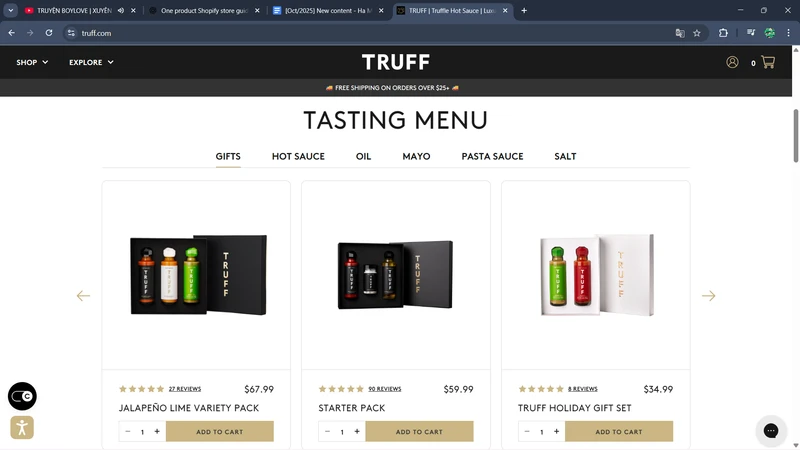
The website design amplifies this premium feel using high-end visuals, glossy finishes, and minimalist layouts that let the product shine. Lifestyle photography adds context, showing TRUFF drizzled on dishes and used in gourmet settings, reinforcing the idea that this isn’t just hot sauce – it’s an elevated culinary experience.
Marketing plays a huge role, too. Influencer endorsements, celebrity shout-outs, and a strong social media presence position TRUFF as a status product. The funnel is clean: see the sauce, understand why it’s special, and click to buy.
Key takeaway: Luxury aesthetics plus strong social validation can elevate even a simple food item into a premium lifestyle brand.
3. Ka’Chava
Ka’Chava is a strong one product Shopify store example for the health-and-wellness niche. The centers around a signature product concept: a nutrient-dense “all-in-one superfood meal shake.” It presents this hero item with clarity, positioning it as a complete meal replacement that delivers balanced nutrition through natural ingredients.
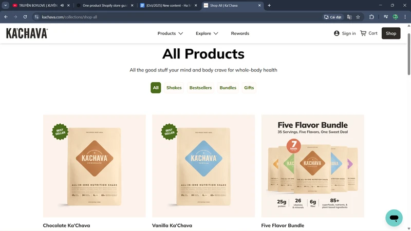
The design supports this wellness message through earthy tones, clean layout, and strong ingredient-focused visuals. Benefits like digestive support, plant-based proteins, and global superfoods are presented with easy-to-scan icons, helping customers quickly understand the value.
Ka’Chava also keeps the buying experience simple – no overwhelming SKUs or long product grids. Variants exist, but all fall under the same core product idea. Educational sections, customer transformations, and nutrient breakdowns build trust and authority in a crowded supplement market.
Key takeaway: A clear, problem-solving product story can make your brand feel expert and reliable – especially in the wellness category.
Read more: How to Bypass the Shopify 100 Variant Limit: A Complete Guide
Cookie Chips turned one quirky idea – “crispy cookie-chip hybrids” – into a fun, snackable brand. Their store introduces the product with bright visuals, delicious close-ups, and playful colors that visually communicate the product’s crunchy-sweet experience.

The website is full of energy, using short, punchy copy and appetite-driven photos to appeal to snack lovers. Simple sections and large images make browsing fast and enjoyable, while embedded videos and lifestyle shots show the product in real snacking moments.
The brand also uses customer photos, recipe mentions, and lighthearted blog content to build a community feel. It doesn’t try to be overly serious – it leans into the fun, novelty factor of the product.
Key takeaway: When your product is playful, let your website match the vibe. Make the experience as fun as the product itself.
Electronics
5. Oura
Oura is best known for its sleek Oura Ring, a smart ring that tracks sleep, recovery, and activity. The store’s entire experience revolves around a special health wearable – discreet, elegant, and built into a piece of jewelry instead of a bulky wristband.
The website’s visuals and design mirror the product’s sophistication. High-resolution close-ups show the ring from every angle, while elegant animations demonstrate its sleep-tracking and biometric features. The layout is uncluttered, guiding visitors naturally from features to benefits without overwhelming them with tech jargon.
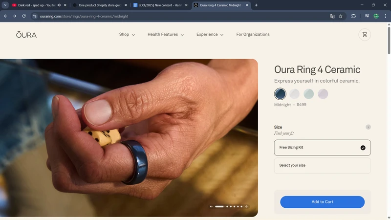
Oura also leans heavily on storytelling: scientific validation, user case studies, and lifestyle imagery that frames the ring as part of a mindful, health-driven lifestyle. The combination of technical authority and soft, aspirational branding makes the product feel both advanced and accessible.
Key takeaway: For electronics product types, pair science with simplicity – clean, premium visuals can turn complex tech into an intuitive experience.
6. AeroPress
AeroPress’ hero product is the AeroPress Original, a coffee brewer, and its variants. What looks like a simple, compact device has become the go-to brewer for travelers, campers, and baristas who want quality coffee without the fuss. Its appeal lies in the surprising versatility hidden inside a very simple form.
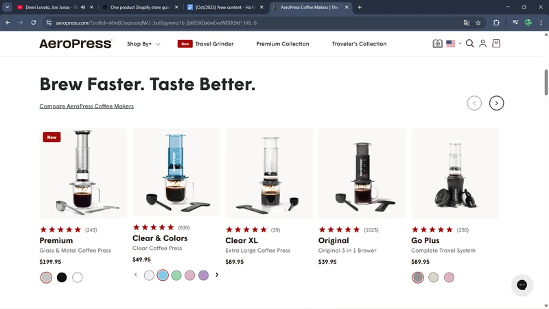
This one product Shopify store website design stays true to the brewer’s practical spirit. The design is minimal and functional: strong product photography, clean backgrounds, and messaging that emphasises portability, ease of use, and high-quality results without unnecessary fluff.
AeroPress also excels at lifestyle positioning. The site showcases the brewer in campsites, offices, and travel setups – all use cases of the product in real-life context, reinforcing “this one item solves your coffee problem everywhere.”
Key takeaway: When your product is simple but powerful, let visual clarity and real-life use cases speak for you.
7. SNOOZ
SNOOZ approaches sleep from a different angle – instead of apps or complicated sleep devices, it focuses on one beautifully engineered white-noise machine designed to help people rest naturally. Its core product delivers a single, calming benefit: better sleep through sound.
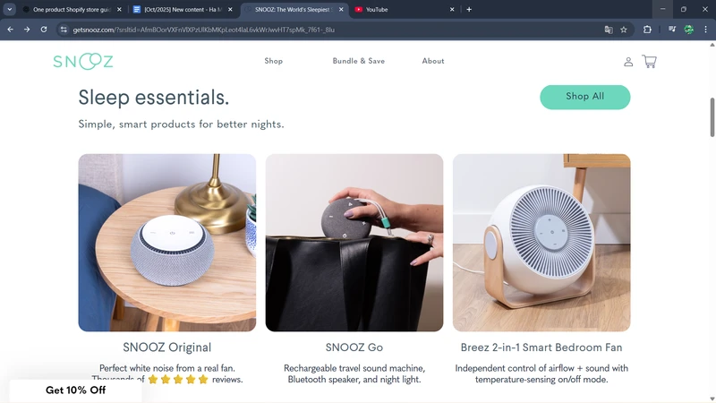
The website uses soft visuals, gentle colors, and soothing typography to create a sleep-friendly aesthetic. Short, clear explanations show how the SNOOZ machine produces natural fan-based sound, while diagrams highlight the technology inside. The interface feels peaceful, making the visitor experience mirror the product’s benefit.
Testimonials and real-world use cases strengthen products’ credibility. On the SNOOZ website, customers can see families, travelers, and light sleepers share reviews about how the product has improved their nights. The site also provides clear guidance to help buyers feel confident in their purchase.
Key takeaway: When your product solves a single, well-defined problem, a one-product set-up helps you map your storytelling, visuals, and user journey around that one outcome.
8. BlendJet
BlendJet gained popularity by solving a simple but relatable problem: blending on the go. Instead of viewing blenders as bulky kitchen appliances, the brand transformed them into portable lifestyle gadgets that fit into bags, gym lockers, and road trips.
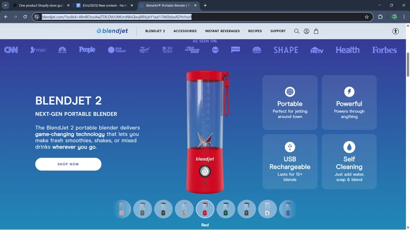
The website excels at showcasing benefits through visuals. Bright colors, bold photography, and quick product demos highlight features like portability, easy cleanup, and powerful blending. Every section is designed to push visitors toward imagining how BlendJet fits into their active lifestyle.
Strong lifestyle marketing drives the brand forward. Influencer videos, user-generated content, and vibrant social proof make the product feel trendy, practical, and community-driven – ideal for impulse purchases and gifting.
Key takeaway: Action-driven visuals make portable tech irresistible – show movement, energy, and everyday use.
Fashion
9. Pillow Slides
Pillow Slides built its entire appeal around one ultra-comfortable product: thick, cloud-like slides designed to feel soft, cushioned, and foot-hugging with every step. This one product store Shopify positions the slides as a relief-focused alternative to stiff sandals – perfect for home wear, errands, or recovery.
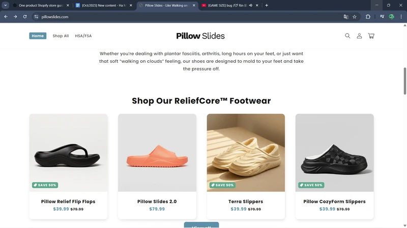
The website leans heavily into comfort-driven visuals: soft gradients, clean layouts, and oversized product close-ups that show off the plush foam material. Clear benefit-driven statements like “walk on clouds” and “relieves foot pain” communicate the experience instantly.
On the website, social proof and testimonials do heavy lifting, with hundreds of customers reinforcing that these slides actually deliver on comfort, building credibility and customer trust. The simplicity of its layout also plays a big role. With no clutter or category overload, the user’s journey naturally flows from curiosity to checkout.
Key takeaway: When your product solves a simple discomfort, let visuals and copy emphasize the feeling customers crave.
10. Shwood
Shwood is known for its signature wooden sunglasses – a product that stands out immediately in a sea of plastic and metal frames. The brand blends craftsmanship with nature, carving eyewear from real wood to create a product that feels artisanal and one-of-a-kind.
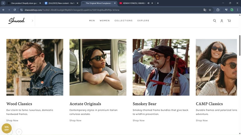
The website highlights this craftsmanship through warm tones, natural textures, and detailed close-ups of the wood grain. Every section reinforces the handmade, Pacific Northwest aesthetic that the brand is built on. The minimal layout keeps the focus on the natural materials and the quality of the finish.
Storytelling plays a big role, too. Shwood emphasizes the sourcing of materials, artisanal manufacturing, and durability, appealing to customers who appreciate sustainable and design-driven fashion. It’s a product with a soul, and the brand makes sure you feel that.
Key takeaway: When your product has a craftsmanship edge, make the process part of the hero story.
11. Beefcake Swimwear
Beefcake Swimwear offers a single standout product line: vintage-inspired, gender-neutral swimwear designed to be fun, comfortable, and inclusive. The brand brings a refreshing twist to swim fashion by focusing on shape, confidence, and bold, retro aesthetics.
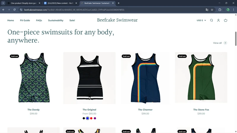
The website reflects this identity with bright colors, playful visuals, and models of all body types, creating an inclusive shopping experience that feels instantly welcoming. The photography is simple but expressive, showcasing how the suits look in real, unposed moments.
The brand’s messaging is clear and personality-driven – humorous, confident, and unapologetically bold. Instead of trying to appeal to everyone, Beefcake speaks directly to people who want something different from typical swimwear. That clarity is what makes the product memorable.
Key takeaway: Don’t dilute your personality. Leaning into a strong brand identity can attract fiercely loyal customers for your one product Shopify store.
12. Dryrobe
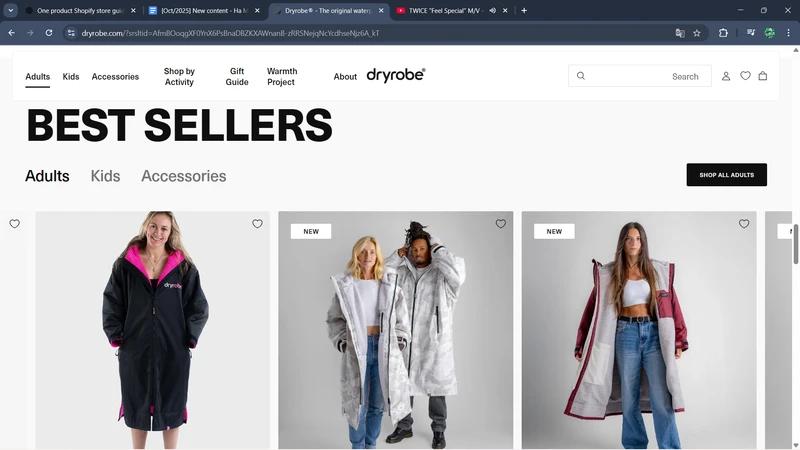
Dryrobe focuses on a single hero product: an oversized, insulated change robe designed for swimmers, surfers, and outdoor athletes to warm up and change comfortably after cold-water activities. The product blends utility with performance, making it a staple for anyone active outdoors.
The website communicates this purpose with dramatic outdoor visuals – athletes changing on windy beaches, adventurers warming up after cold water sessions, and clear demonstrations of the robe’s weatherproof materials. The imagery instantly positions Dryrobe as a piece of technical gear rather than casual apparel.
Functionality is emphasized throughout the site, with detailed feature breakdowns, real-world use cases, and athlete endorsements. The messaging makes it clear that the robe solves a genuine problem for people who train in the elements, and the premium price feels justified through context.
Key takeaway: Strong environmental context helps functional products shine – show your product in the conditions it was built for.
Beauty & Care
13. Neck Hammock
The Neck Hammock introduces a clever, physical-therapy-inspired solution: a portable neck traction device designed to relieve tension and improve posture. Its appeal lies in the promise of quick, at-home pain relief without bulky equipment or clinic visits.
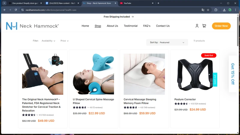
The website does an excellent job of explaining the “how” behind the product. Clear illustrations, short demos, and simple benefit-led sections walk visitors through the science of gentle cervical traction. The visuals are clean and clinical without feeling intimidating, which builds credibility while keeping the experience friendly.
Social proof also plays a major role. Testimonials, user videos, and professional endorsements (including PTs and chiropractors) help reassure customers that this device is not a gimmick – it’s a trusted wellness tool.
Key takeaway: When your product solves a physical problem, use education and expert-backed proof to establish trust quickly.
14. Her Stories (formerly Brew Blue)
Her Stories focuses on one hero product line: their calm-inducing wellness bundle designed to help with stress, sleep, and emotional balance. The concept is simple but powerful – wearable patches that release natural active ingredients throughout the day.
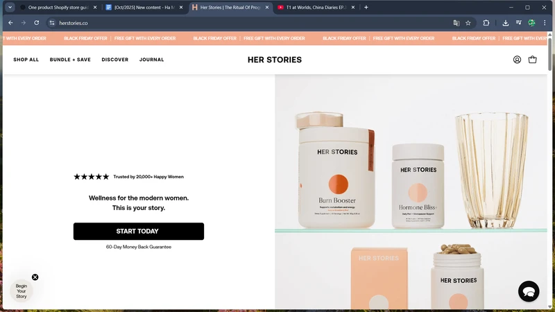
The website leans into soft visuals, modern minimalism, and warm, feminine aesthetics. The brand story centers around emotional well-being, making the shopping experience feel safe, gentle, and empowering. Clean product pages break down ingredients, how the patches work, and when to use them, reducing the hesitation often associated with wellness innovations.
What strengthens this one product Shopify store even more is its relatable messaging. Real stories, customer reviews, and lifestyle imagery highlight everyday women using the patches during work, parenting, or stressful commutes. It’s a product framed not as a supplement, but as emotional support you can wear.
Key takeaway: Pairing wellness with emotional storytelling creates deep resonance — customers want products that feel like support, not medicine.
15. State of Kind
State of Kind focuses on one premium skincare centerpiece: a multi-tasking, clinically tested serum designed to simplify routines without sacrificing results. Instead of selling dozens of steps, the brand offers one powerful formula that handles hydration, brightening, and skin health.
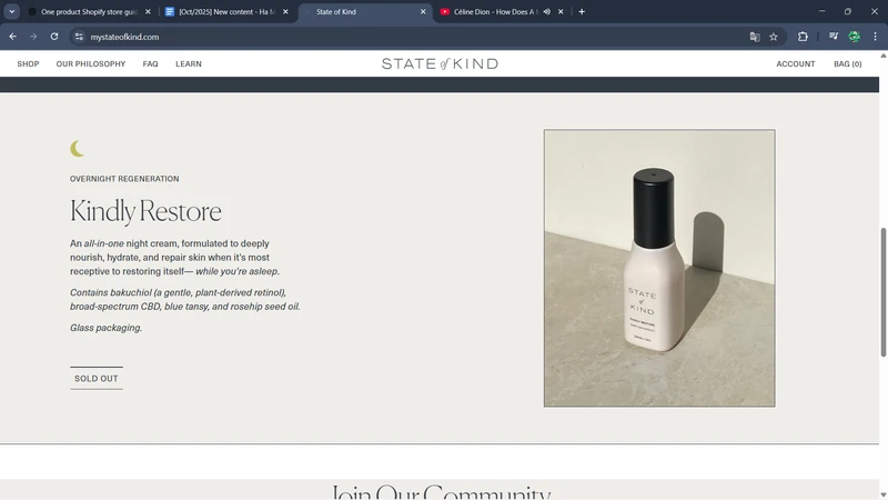
The website reinforces this “less but better” philosophy with clean layouts, scientific diagrams, and ingredient transparency. The product page feels like a conversation with a dermatologist — clear evidence, clear claims, and no overwhelming jargon. The photography and color palette reinforce a high-end, modern aesthetic.
Community-driven proof also carries the experience. Before-and-after photos, dermatologist endorsements, and honest user stories give the serum authority, making customers feel confident about switching from multi-step routines to one hero product.
Key takeaway: In skincare, credibility comes from clarity – show the science, simplify the message, and let results speak louder than claims.
16. BALLS
BALLS built its identity around a single male grooming trimmer designed specifically for intimate areas. By leaning into bold humor, the brand removes the awkwardness that normally surrounds this category.

The website’s main strength is its conversion-focused structure. Every scroll section leads naturally toward checkout: problem – solution – reassurance – guarantee – CTA. This sequential logic lowers hesitation for a purchase that can feel sensitive or risky.
The store also excels at disarming customers with humor while delivering real information. Comedic headlines pull people in, but detailed feature breakdowns, safety assurances, and straightforward maintenance tips close the sale. It’s the perfect balance of entertainment and trust.
Key takeaway: When done with style and consistency, humor can make even taboo topics feel fresh, memorable, and easy to buy.
Home & Decor
17. Kulala Land
Kulala Land sells a single hero product: a smart lamp designed to help babies and families sleep better. It combines gentle lighting, routines, and sleep science into one calming bedtime companion.
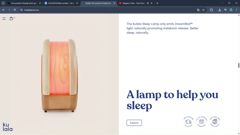
This Shopify one product store stands out through its storytelling rather than its product features. Instead of describing the lamp in technical terms, it paints a picture of peaceful nighttime routines – dimming the light, settling a child, winding down as a family. This emotional narrative turns the lamp into part of a shared bedtime habit.
What also makes the brand memorable is its expert-backed positioning. Kulala integrates guidance from sleep specialists directly into the site, offering tips and explanations on circadian rhythms and baby sleep behavior. It establishes the product as not just a lamp, but a trusted tool for parents navigating nighttime challenges.
Key takeaway: If your product is part of a daily ritual, build your brand around that routine — not the hardware.
18. Lasso Clock
Lasso Clock introduces a modern twist on traditional timepieces through a single, striking product: a circular wall clock where the minute and hour indicators move around a fixed loop. It’s functional, sculptural, and visually intriguing all at once.
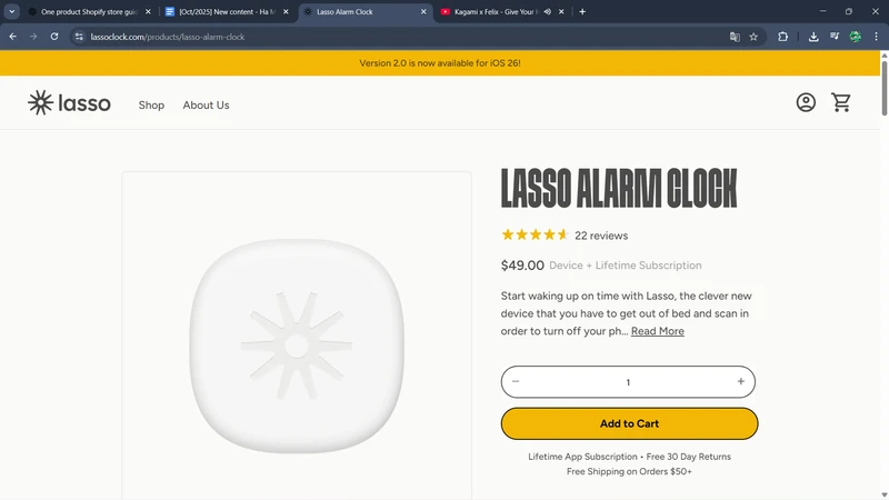
The website focuses on object-as-art presentation. Minimal spacing, gallery-style photography, and dramatic lighting make the clock feel like a design exhibit rather than a home accessory. The product page reads like an art piece description – elevating perceived value.
Lasso Clock also leverages architectural lifestyle context. The clock is shown in curated interiors: Scandinavian living rooms, minimal workspaces, and clean modern homes. This helps customers visualize it not just as a functional item, but as the centerpiece of a room’s aesthetic.
Key takeaway: Treat your product like a piece of art if you want customers to see it that way.
19. PillowPup
PillowPup offers one delightfully unique product: fully custom pet pillows where customers upload a photo of their dog (or cat) and receive a plush pillow printed with their pet’s face. It’s playful, emotional, and irresistibly personal.

The store’s strength is its visual personalization journey. The site shows adorable examples of completed pillows, highlighting how lifelike and charming each custom order looks. This creates instant emotional pull – shoppers immediately imagine their own pet on a pillow.
What truly sets PillowPup apart is the smooth, buyer-friendly customization flow. Uploading an image, adjusting the crop, and previewing the final look feels intuitive and quick. For a highly personalized product, the checkout feels surprisingly frictionless, which boosts confidence and reduces cart abandonment.
Key takeaway: When selling custom products, make the creation process fun, simple, and instantly rewarding.
20. Boy Smell
Boy Smells carved its identity around one hero fragrance category: candles that blend traditionally masculine and feminine scent notes into something unexpected and modern. Their iconic pink packaging and genderful positioning made the brand instantly recognizable.
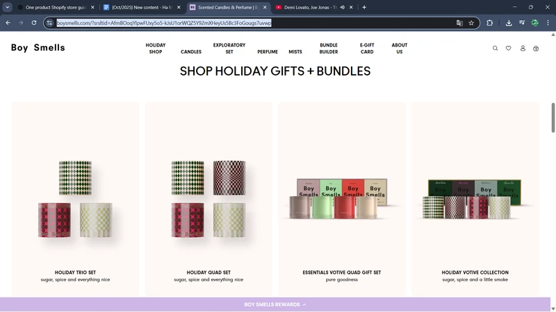
The website excels through its aesthetic tension – a mix of soft pastel color palettes paired with bold typography and sensual, moody product photography. This juxtaposition mirrors the candle concept itself: both gentle and strong, floral and earthy. Its brand identity is captured visually.
Boy Smells also leverages editorial storytelling, using poetic scent descriptions and atmospheric copy that evokes emotions instead of listing technical fragrance notes. This gives each candle personality and depth, making the shopping experience feel like browsing an indie magazine.
Key takeaway: A distinctive aesthetic paired with editorial storytelling can elevate a simple home product into a cult lifestyle brand.
How to Build a One Product Shopify Store Step-by-Step
Selling only one product doesn’t mean limiting your potential – it means focusing your brand, design, and marketing on a single, irresistible solution. A well-executed one-product Shopify store can simplify decision-making, strengthen branding, and boost conversions.
Here’s a clear, step-by-step guide to building your own one product store Shopify.
Step 1: Pick your winning “hero” product
Choosing the right product is critical. Look for something that solves a clear problem, has a strong USP, and appeals to a specific audience.
Validate demand using market research, competitor analysis, and social proof. Ideally, it should be easy to explain in seconds and visually compelling for your website.
Step 2: Set up your online store
Once you have a product, your Shopify store becomes the stage to showcase it. This step focuses on presenting your hero item in the most engaging and conversion-friendly way possible.
- Choose the perfect one product Shopify store theme: Select a theme that highlights a single product with large visuals, simple navigation, and a clean layout. Minimalist and mobile-optimized themes work best to avoid distractions and keep attention on your product.
- Create compelling product content: High-quality images, lifestyle shots, and videos help visitors imagine using your product. Combine them with concise, benefit-driven copy, emphasizing how your product solves a problem or improves the customer’s life. Include trust signals like reviews, testimonials, and certifications.
- Customize your storefront: Tailor your Shopify theme to match your brand identity – colors, fonts, and layout. Make the call-to-action (CTA) buttons clear and prominent. Organize content in a way that guides visitors naturally from curiosity to purchase without clutter or confusion.
- Configure your store settings and logistics: Set up essential backend details such as store locations, warehouse addresses, tax settings, and inventory tracking. These foundational settings ensure smooth fulfillment, accurate delivery rates, and a reliable shopping experience once orders start coming in.
Read more: How to Set Up Multiple Shopify Locations for Your Store?
Step 3: Launch and market your store
With your store live, it’s time to attract visitors. You can use targeted ads, social media, influencer collaborations, and email campaigns to reach your ideal audience. After that, don’t forget to track analytics closely to optimize your funnel, tweak messaging, and improve conversion rates.
Key tip: One-product stores thrive on simplicity and clarity. Every page, image, and sentence should reinforce your hero product’s value – from discovery to checkout.
Why It Might Be Smart to Sell Only One Product
Focusing on a single product is no doubt a surprisingly powerful strategy for Shopify merchants. Here are some of the reasons why:
- Clear and persuasive messaging: With only one product, your website and campaigns can communicate the value proposition directly, leaving no room for confusion.
- Simplified purchasing process: Fewer choices mean less decision fatigue for customers, making it easier to convert visitors into buyers.
- Focused brand identity: A single product allows you to build a cohesive brand story, turning the item into a lifestyle or signature solution.
- Optimized marketing and growth: All your advertising, content, and promotions can target one audience with precision, improving ROI and scalability.
FAQs – One Product Shopify Store
What is the best Shopify theme for a single product store?
The best theme highlights your hero product with large visuals, minimal distractions, and clear calls-to-action. Popular options include Debut, Narrative, or Turbo, which offer clean layouts and mobile optimization, helping visitors focus on your product and story.
How to promote my Shopify one product store?
To promote your one-product store, you should use a mix of targeted advertising, social media campaigns, influencer partnerships, and email marketing to reach your ideal audience. Focus on storytelling, lifestyle content, and showing your product in real-world contexts to drive engagement and conversions.
What are top products for one product Shopify store?
Products that solve a clear, specific problem or enhance a lifestyle work best. Examples include health and wellness items, unique gadgets, personalized gifts, and niche home decor – essentially, anything with a strong USP that’s easy to market visually.
Is it better to sell one product or multiple products?
It depends on your strategy. One product allows for a focused brand, simplified marketing, and higher conversion rates, while multiple products offer diversity and cross-selling opportunities. For startups, a single product often helps validate demand before scaling.
Conclusion
A one product Shopify store isn’t just about selling a single item – it’s about creating a focused, memorable brand that connects deeply with your audience. By concentrating on one hero product, you can craft stronger visuals, sharper messaging, and an optimized buying experience that drives higher conversions.
Ready to turn your product into a hero? Start building your one-product Shopify store today, focus your energy on what matters most, and watch your brand stand out in the crowded eCommerce world.
And as your store grows, you may eventually expand into new variants, bundles, or complementary products. BulkFlow can help you scale without the hassle – allowing you to import multiple products, clean data, and update listings in bulk with just a few clicks. It’s the easiest way to grow your catalog while keeping your workflow fast and efficient.


